Five of the Best French Election Infographics
Next Sunday evening the world will learn which of Emmanuel Macron or Marine Le Pen will be France’s new president.
No election has been more important for the future of Europe, and perhaps the world, than this one, as our Director Bill Emmott explains.
We have selected five of the best infographics that make sense of the first-round election results, current polling and their implications. We’d love to hear what you think
1. Deutsche Gesellschaft für Auswärtige Politik have summarised the two candidates’ stances on key international issues. Le Pen and Macron differ dramatically on their attitudes to foreign policy and trade, with vast implications for Europe, NATO and the world:
2. Huge variations in the voting patterns of different age groups continue to characterise Western elections. This IPSOS France table tells the story of how generational divisions played out in the first round, including the fact that Le Pen did better than Macron with voters under the age of 50:

Notice the inverse relationship between Fillon and Mélenchon’s results. Fillon was the candidate who most represented France’s political old status quo and attracted by far the most support from older generations. By contrast Mélenchon, a maverick left-wing candidate, was wildly popular among France’s youngest voters.
How Mélenchon’s young supporters vote next will be a critical factor in determining the final result (see next graphic). But so too will the choices of older voters who are likely to be worried about the impact on their savings of a Le Pen victory.
3. This Guardian graphic uses Ifop polling data predicting how votes for the first round losers will be redistributed, including those crucial Mélenchon youth votes:

4. The first round was a victory for French pollsters as much as anyone else, particularly after less-then-impressive recent performances by counterparts in the UK and US (David Cameron’s 2015 election victory, Trump’s 2016 defeat of Clinton and the 2016 Brexit result all caught pollsters by surprise).
These Telegraph charts demonstrate how close France’s first round election results were to polling averages:

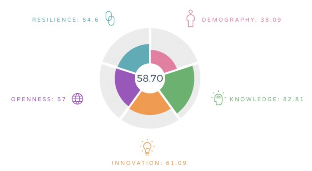
5. The Wake Up Foundation’s 2050 Index explores the underlying factors driving political developments in France and elsewhere. Despite being Europe’s second largest economy (bigger than the UK thanks to sterling’s post-Brexit devaluation), France ranks twentieth out of thirty-five due to significant weaknesses in demography and resilience:
Find out more: http://wakeup2050index.eu/country/france/